DEPOT ALLOCATION SOFTWARE
Brough UI consistency comprise both visual and functional adhering to best design practices to improve usability, aesthetics and reduces user errors.
1. My Responsibility
Design Consistency & Usability
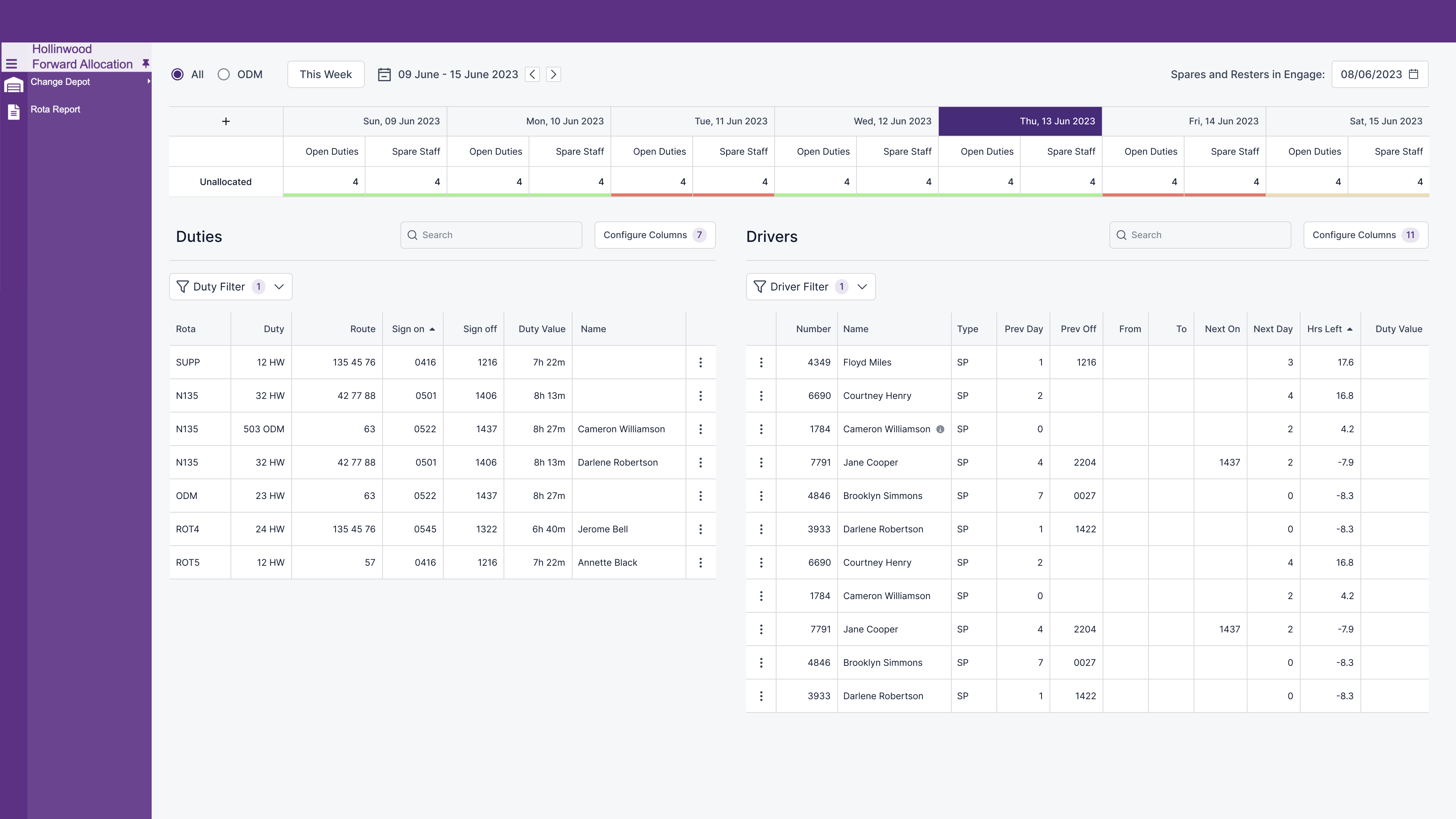
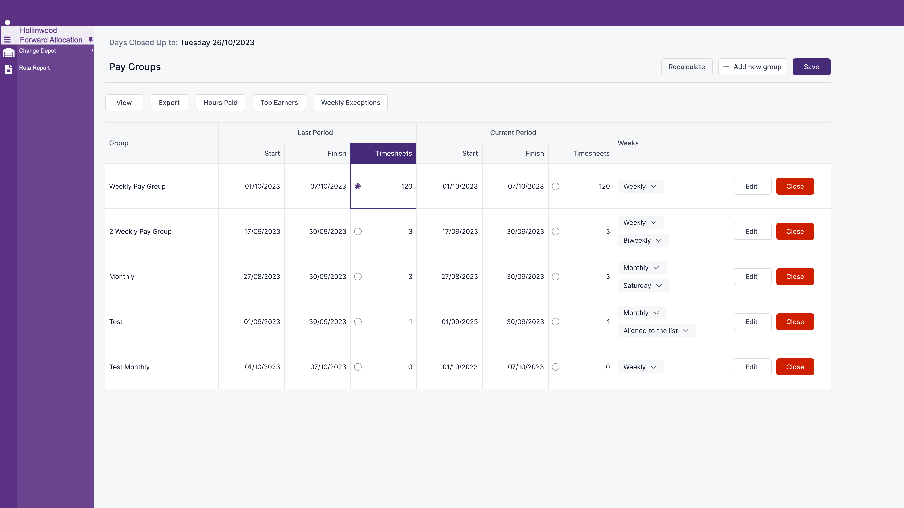
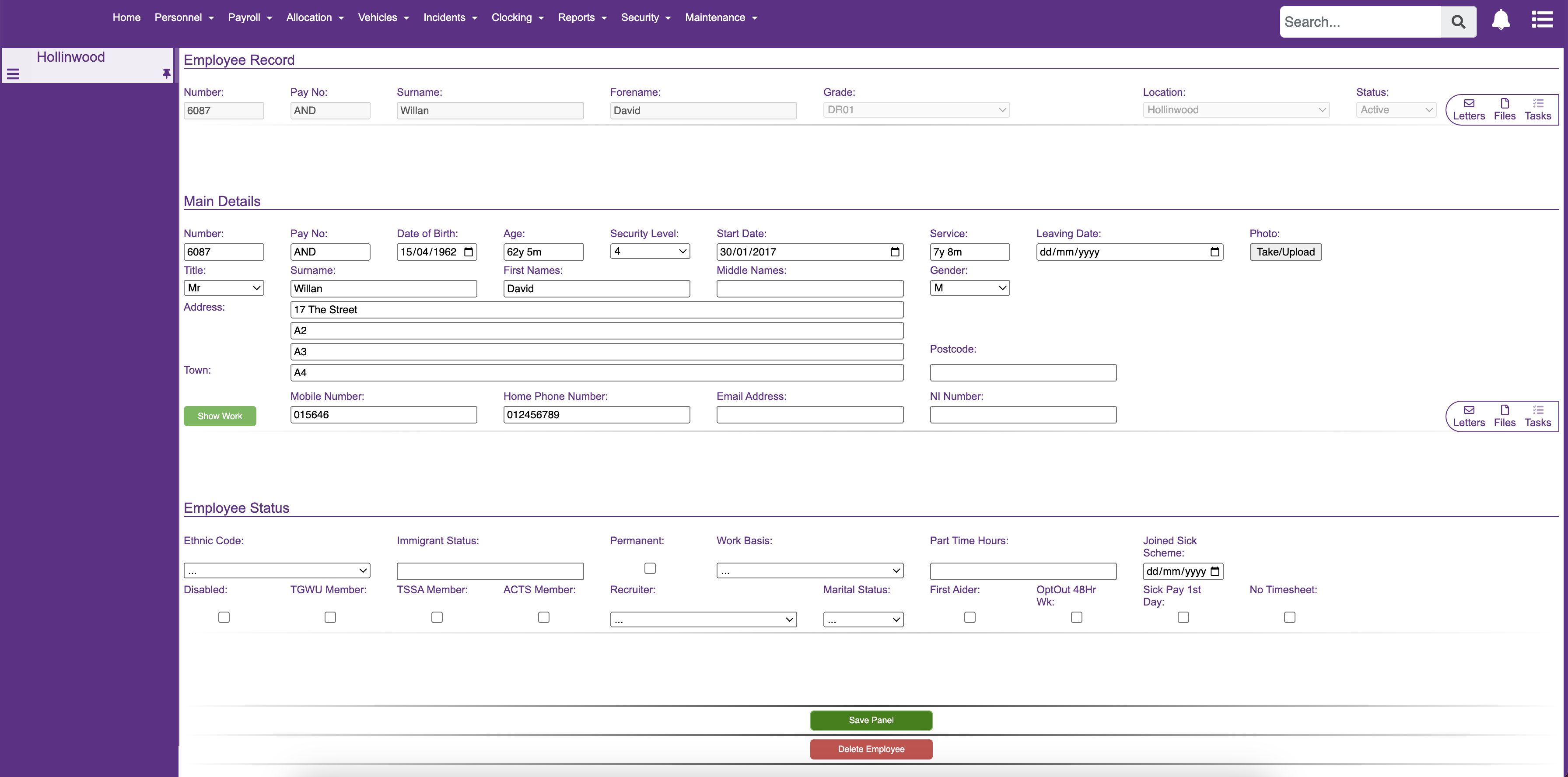
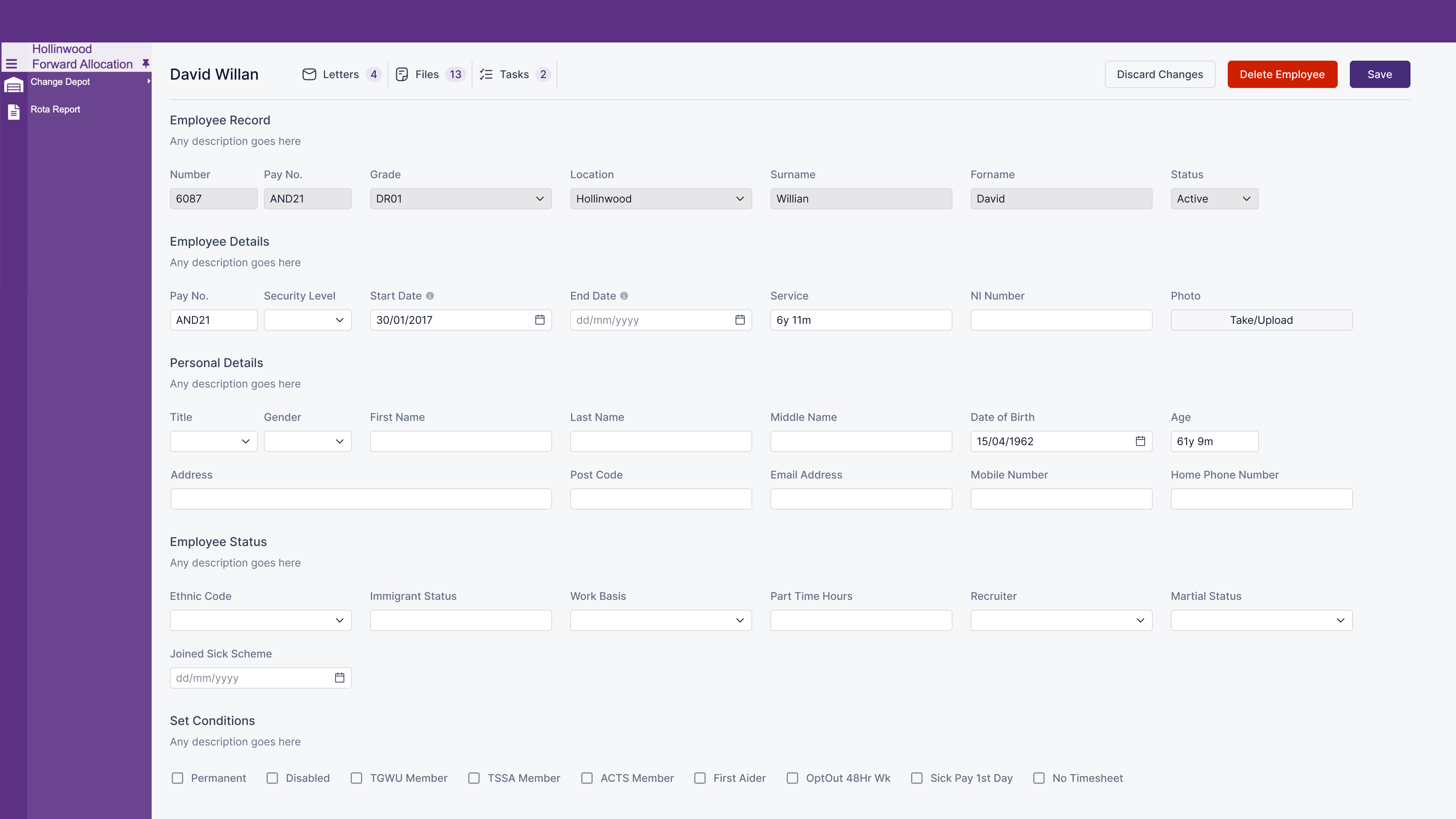
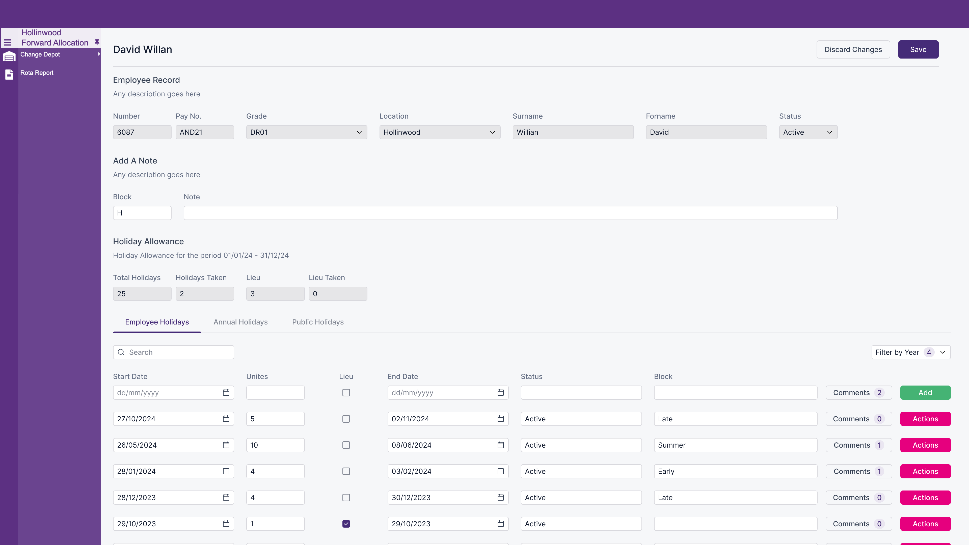
To enhance the software’s usability and address existing issues, I implemented best practices re design the pages based on laws of UX. This included maintaining consistent font choices in style, size, and weight, ensuring that similar actions—like clicking buttons or navigating menus—produce similar results, and using uniform designs for related controls and UI components (e.g., buttons and forms) throughout different sections.
2. My Goals
Great Product Experience
Design consistency is essential for creating a great product experience. It achieves this by making elements predictable, which shortens the learning curve, enhances aesthetics, reduces user errors, and reinforces brand recognition through uniform visual and functional elements.
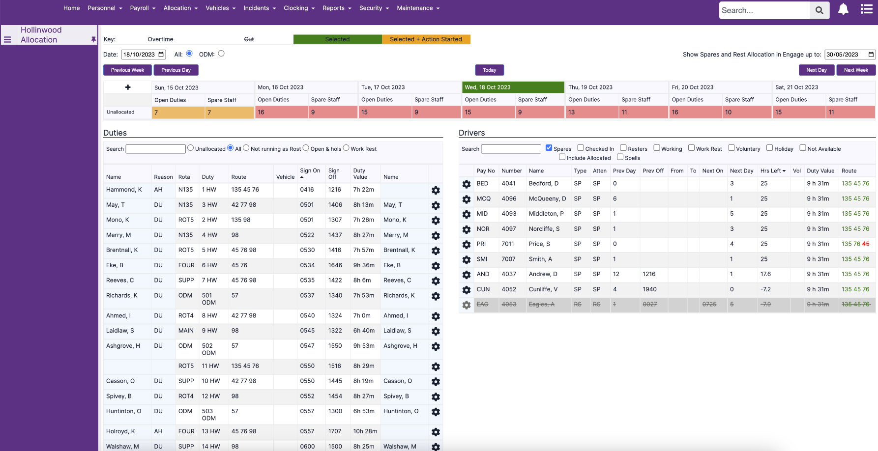
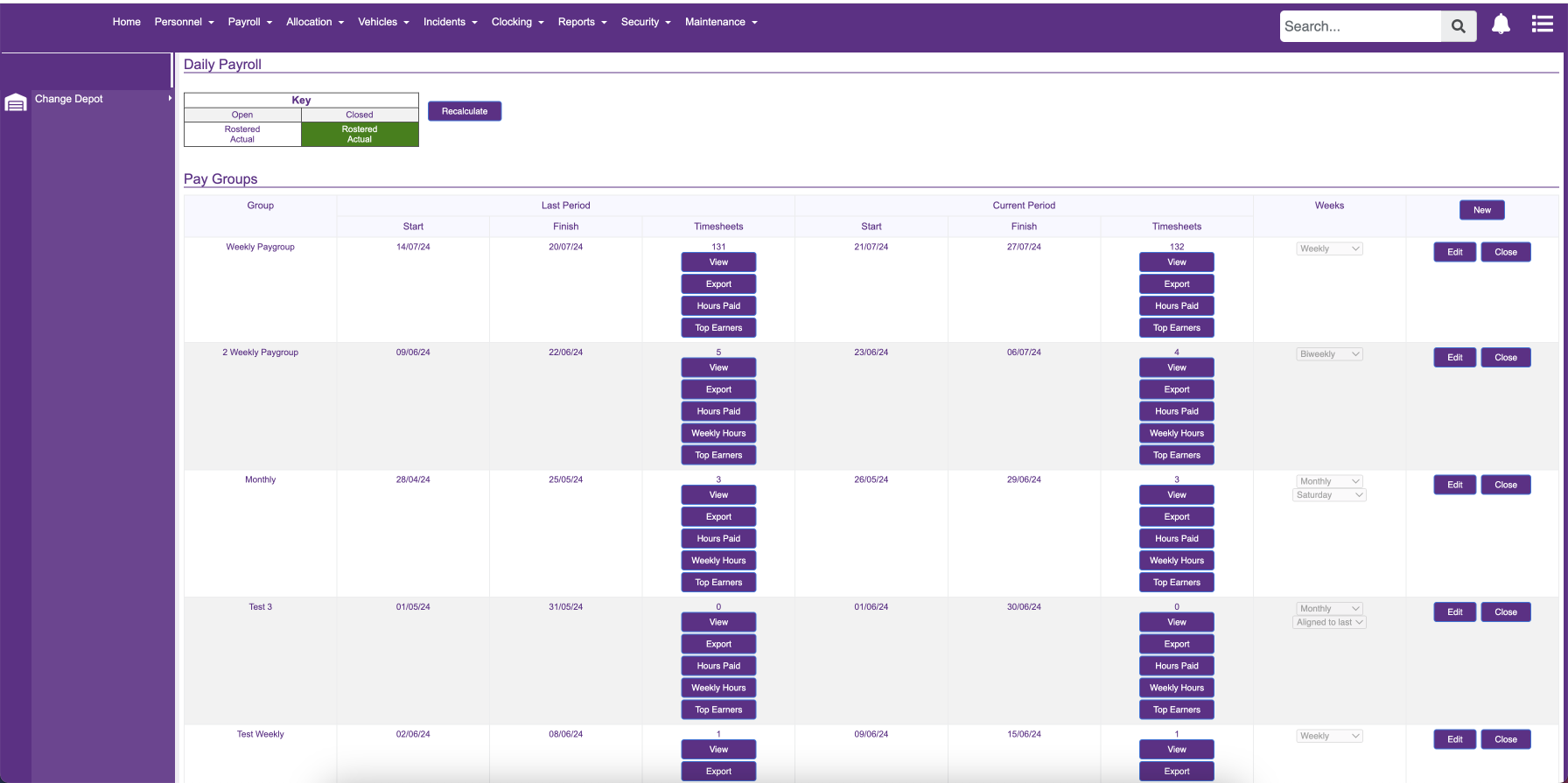
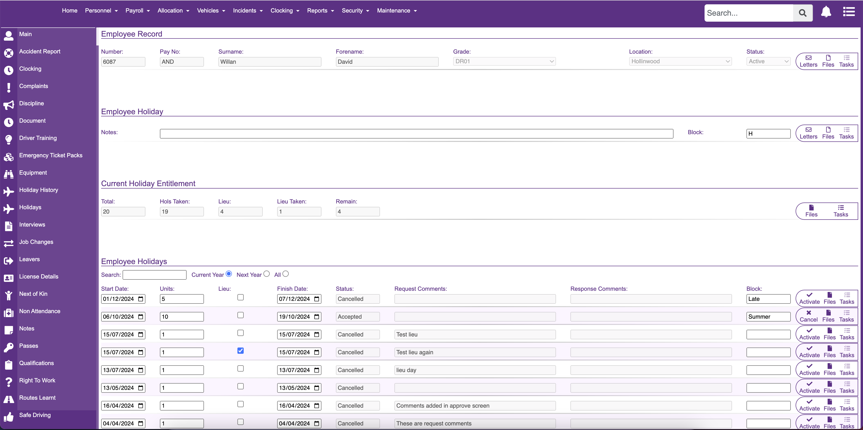
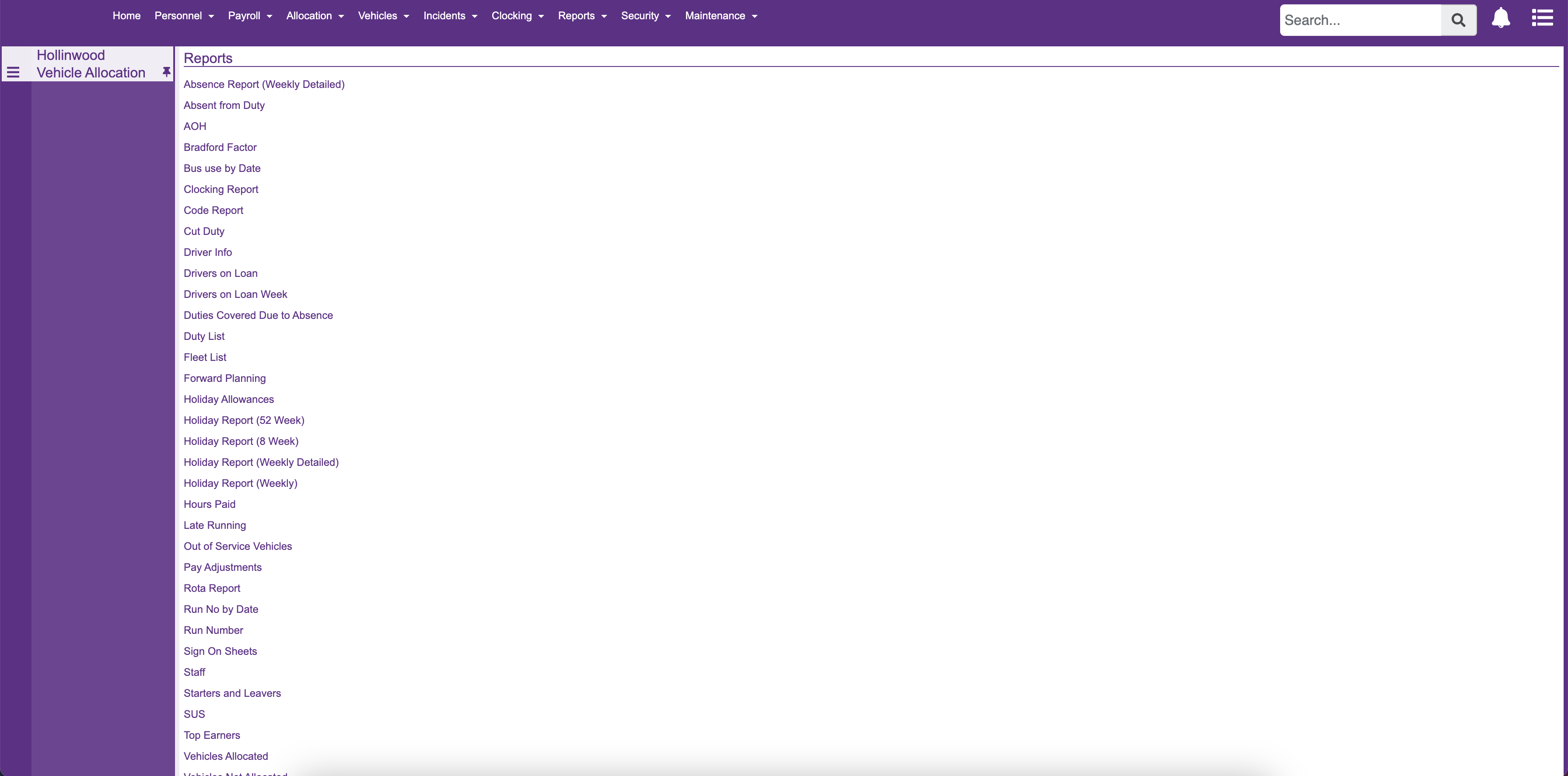
I believe accessibility is a key focus for improving usability, as the software has many pages without headers, uses smaller font sizes, and features purple text, which significantly reduces color contrast and makes the text harder to read.
Improved Usability
Users can expect how elements will function, creating a smoother and more intuitive experience.
Enhanced Aesthetics
A cohesive look boosts the visual appeal and professionalism of the design.
Reduced Errors
Predictable interactions reduce user errors and improve reliability.
Faster Learning
Users who are familiar with one part of the system can easily navigate others, minimizing the need for extensive learning.
3. Design Prcoess
Research & User Testing
In addition to standard principles for achieving design consistency and enhancing usability, the product owner and I conducted user forums to gather feedback on the current system and the issues users face. These forums provided valuable insights and helped us prioritise which areas of the software needed improvement.
Once we had high-fidelity mockups, we conducted user testing using Maze to validate the designs and collect quantitative metrics such as task success rate, misclick rate, and average time to complete tasks. This data provided the validation needed to continue our work on various parts of the software. Below 3 main principles are implemented to achieve design consistency.
Design Systems and Style Guides
Create and follow comprehensive design systems or style guides that define standards for visual and functional elements.
Component Libraries
Utilize component libraries to ensure consistent design elements and interactions.
User Testing
Perform regular user testing to ensure that consistency aligns with user expectations and needs.
4. Visual Designs
UI Patterns
When it comes to visuals and human perception, certain elements stand out more due to size, color, and other factors. Think about your screen visuals in terms of what users will notice first, second, and so on. I also focused on few UX laws to build these patterns and other UI designs.
Aesthetic Usability Effect
Research shows that an aesthetically pleasing design can trigger positive responses in users' brains, leading them to believe the design functions better. Users often associate good-looking designs with high performance, and we can leverage this tendency. With that in mind, I redesigned the pages to be visually appealing while ensuring that aesthetics didn't compromise functionality. As a designer, I focused on creating a UI that not only looks good but also works effectively, prioritizing usability for long-term success.
Hick's Law
The principles i followed based on Hick's Law are: minimize the number of choices when response times are critical to reduce decision time; break down complex tasks into smaller, more manageable steps to reduce cognitive load; and avoid overwhelming users by emphasizing the most important actions.
5. Visual Designs
Design hierarchy
A clear visual hierarchy of UI design elements greatly enhances UI consistency. Whether users realize it or not, they naturally focus on the order and priority of the elements they interact with. I followed the process called ” Chuncking ” based on Miler’s Law.
Chunking
Chunking helps users quickly scan and process content by breaking it into smaller, digestible pieces. This approach allows users to easily identify information relevant to their goals and process it more efficiently. Additionally, chunking helps users recognize underlying relationships by organizing content into distinct sections, applying rules to separate information, and establishing a clear hierarchy. Structuring content in this way aligns with how people naturally evaluate and process digital information, making it easier for them to navigate and understand.
6. Visual Designs
Content Structure
Well-structured content enhances usability by guiding users through the interface and providing them with the information they need to make informed decisions. Clear, concise language and relevant details help prevent confusion and ensure that users can easily find what they’re looking for. Furthermore, effective content organization can improve user engagement, retention, and overall satisfaction with the product.
7. Accessibility
Product for everyone
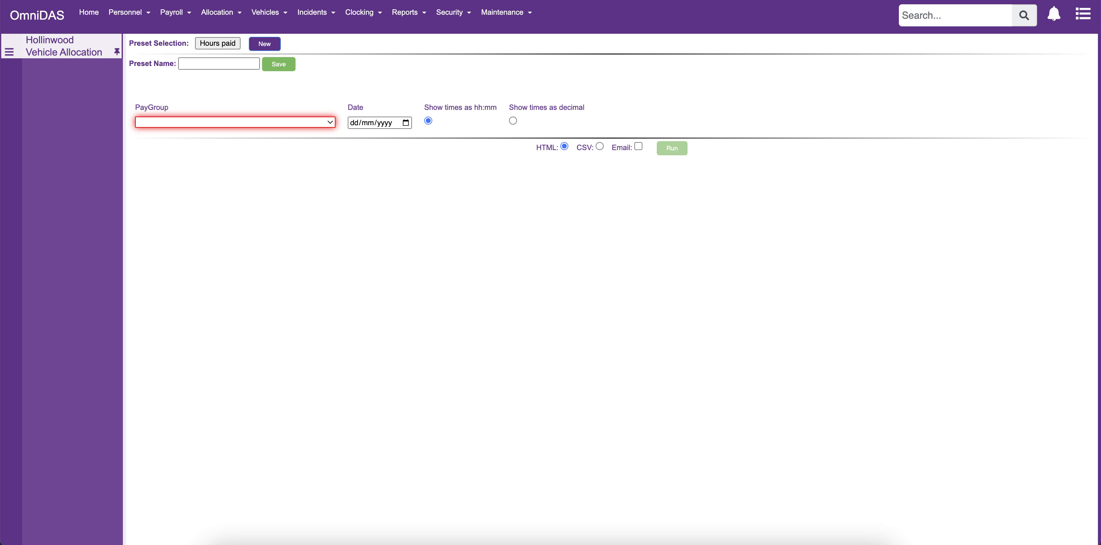
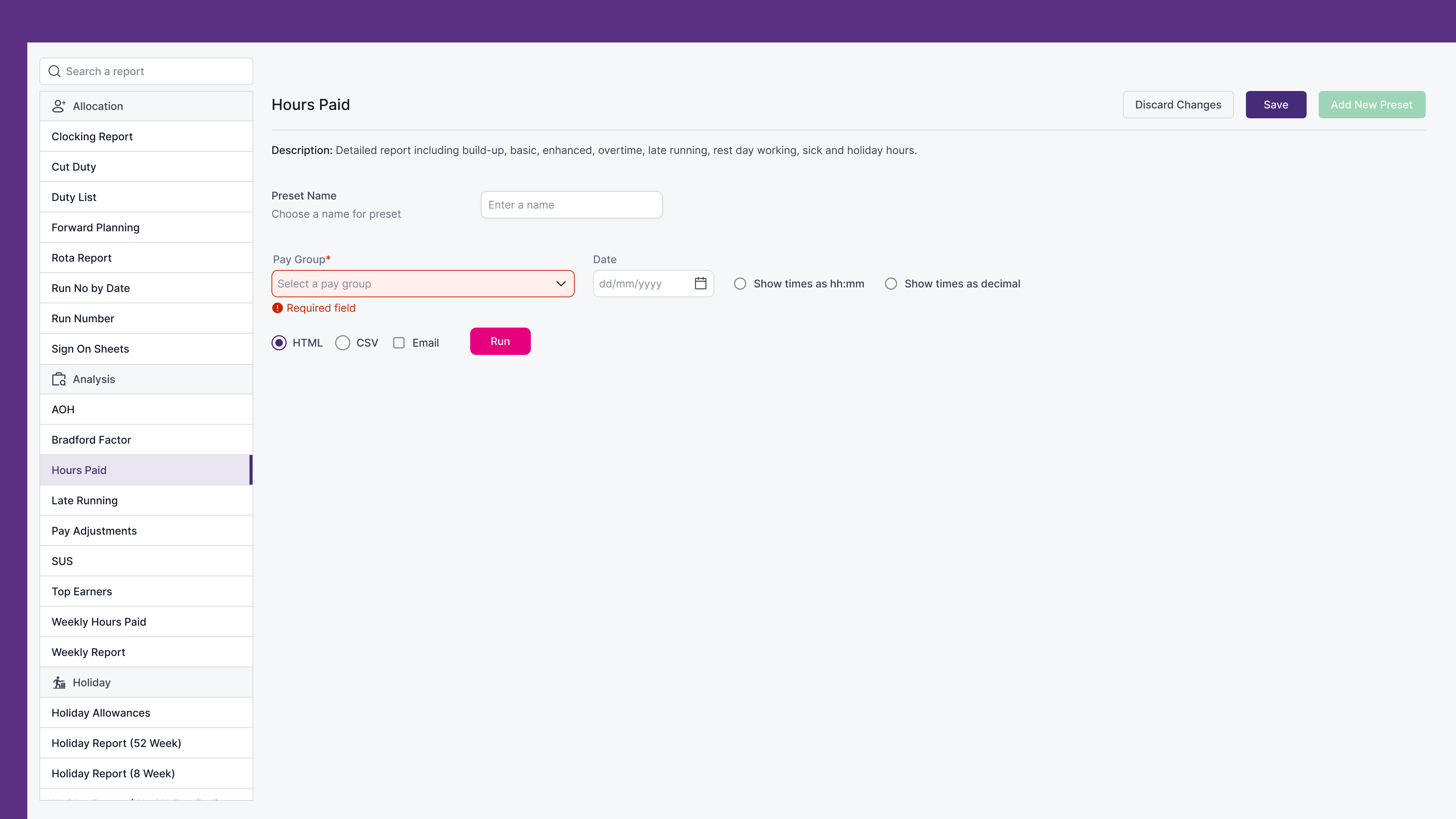
One of our primary goals is to ensure that accessibility is fully integrated in accordance with the Web Content Accessibility Guidelines (WCAG). During the redevelopment of the cloud version of our software, we identified numerous accessibility issues across nearly all pages. These shortcomings can significantly hinder the user experience, particularly for individuals with disabilities. Certain pages contain forms that are missing two crucial elements for accessibility: clearly defined boundaries and visible labels. Currently, required fields are indicated solely by a red border, without any accompanying text to clarify that these fields are mandatory.

