ENTERPRISE DASHBOARD DESIGN
We accelerate the digital transformation with an open source platform, designed to augment current state ERP systems whilst leveraging existing investments.
1. My Responsibility
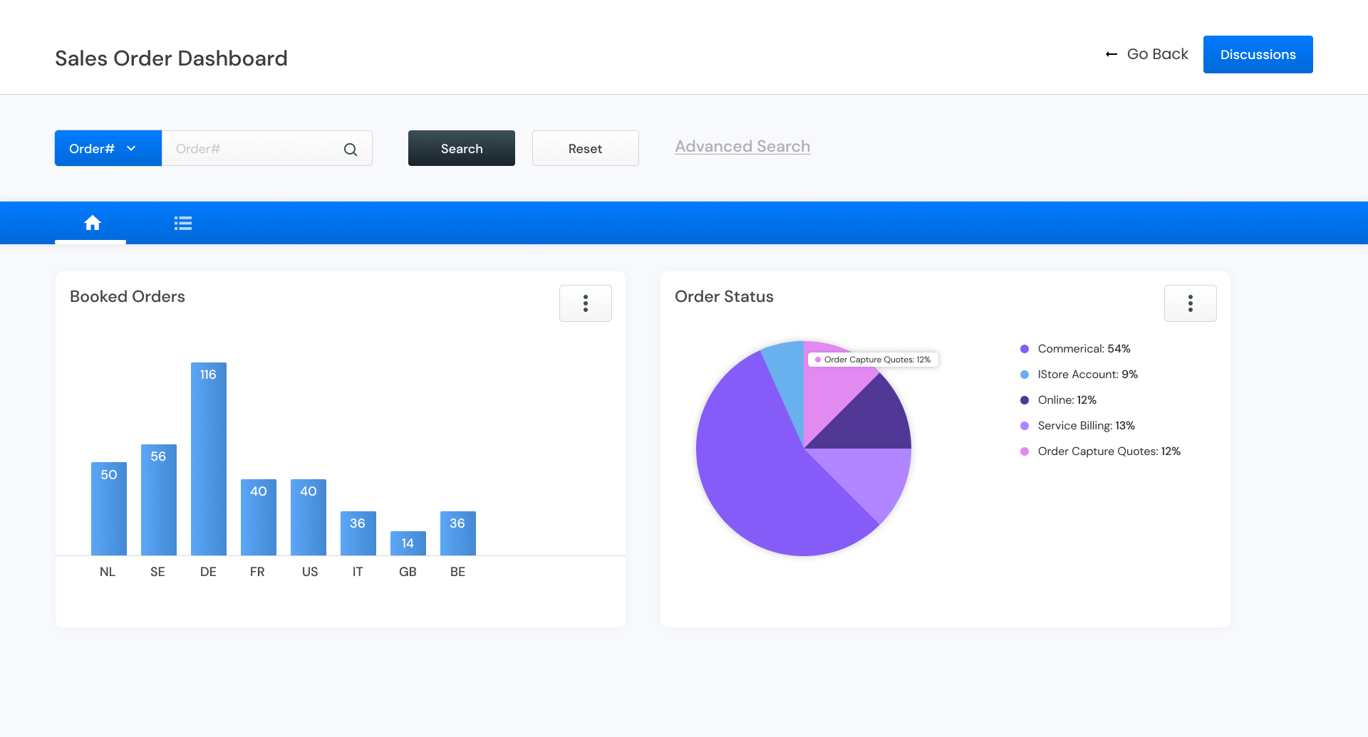
Design a responsive enterprise dashboard & UI components.
I’ve joined the development team as a solo designer to help create UI components, including tables, text and data fields, and cards.
2. Project Overview
Expectations & Challenges from a Design Perspective
The client was working on an enterprise solution to help business owners speed up their digital transformation by offering an open-source stack solution, services, and an operating model built on the Oracle Product Suite.
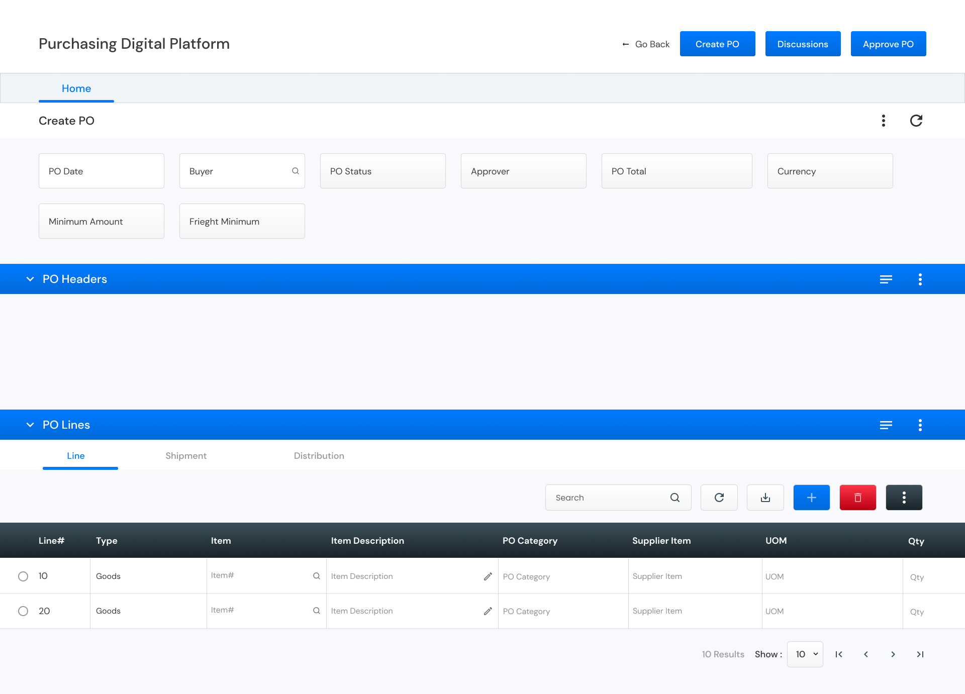
One of the team’s key challenges was refining UI components such as data tables, text and data fields, cards, form fields, grids, and chat interfaces. As a designer, my role was to assist the development team in creating the necessary components, as well as designing the home page, dashboard, and other internal pages. I utilized Zeplin to hand off the final designs and provide design specifications to support their implementation.
3. Design Principles
Design Principles for design journey
As the application is still in the final stages of its official launch, I wasn’t able to engage with end users directly. Instead, I chose to interview the developers who have a close understanding of the application. Through our daily standups with developers and stakeholders, we identified key components to prioritize before testing with end users.
In addition to interviewing internal users, I conducted secondary research to support my designs. I explored articles and theses to gain insights into designing tables for reusability. I created a detailed presentation that outlines best practices for using text fields and data fields to enhance usability.
From my secondary research, I developed the following design principles.
Table Functionality
Attach contextual information to assist users in understanding the data they’re viewing while scrolling through a table. This feature is especially crucial when designing tables with large data sets or for smaller screen sizes.
Common Actions
Enable users to perform common actions swiftly without needing to navigate to a new page. This approach saves time and reduces frustration for users dealing with simple, repetitive tasks.
Colour & Iconography
Utilize the appropriate icons to enhance usability for users. Each button should clearly convey its action through color coding and relevant icons.
Use Clear Contrast
Create a hierarchy in the table by introducing contrast. This can be achieved through varying text styles and backgrounds. Distinguish header text from column text by altering the weight and color.
Add Visual Cues
Incorporate different colored backgrounds to provide organizational context and meaning to the table. These visual cues make the data easier to scan and comprehend.
Line Height
Select a line height that best suits the type and volume of data in your table. Standard and spacious row heights create more white space, making it easier to read extensive data sets.
4. Visual Designs
UI Components
Table Component ( Old vs New )
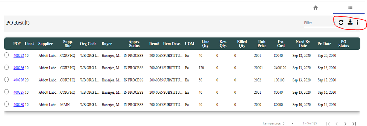
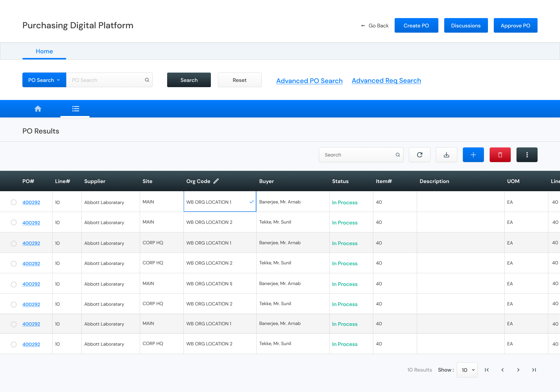
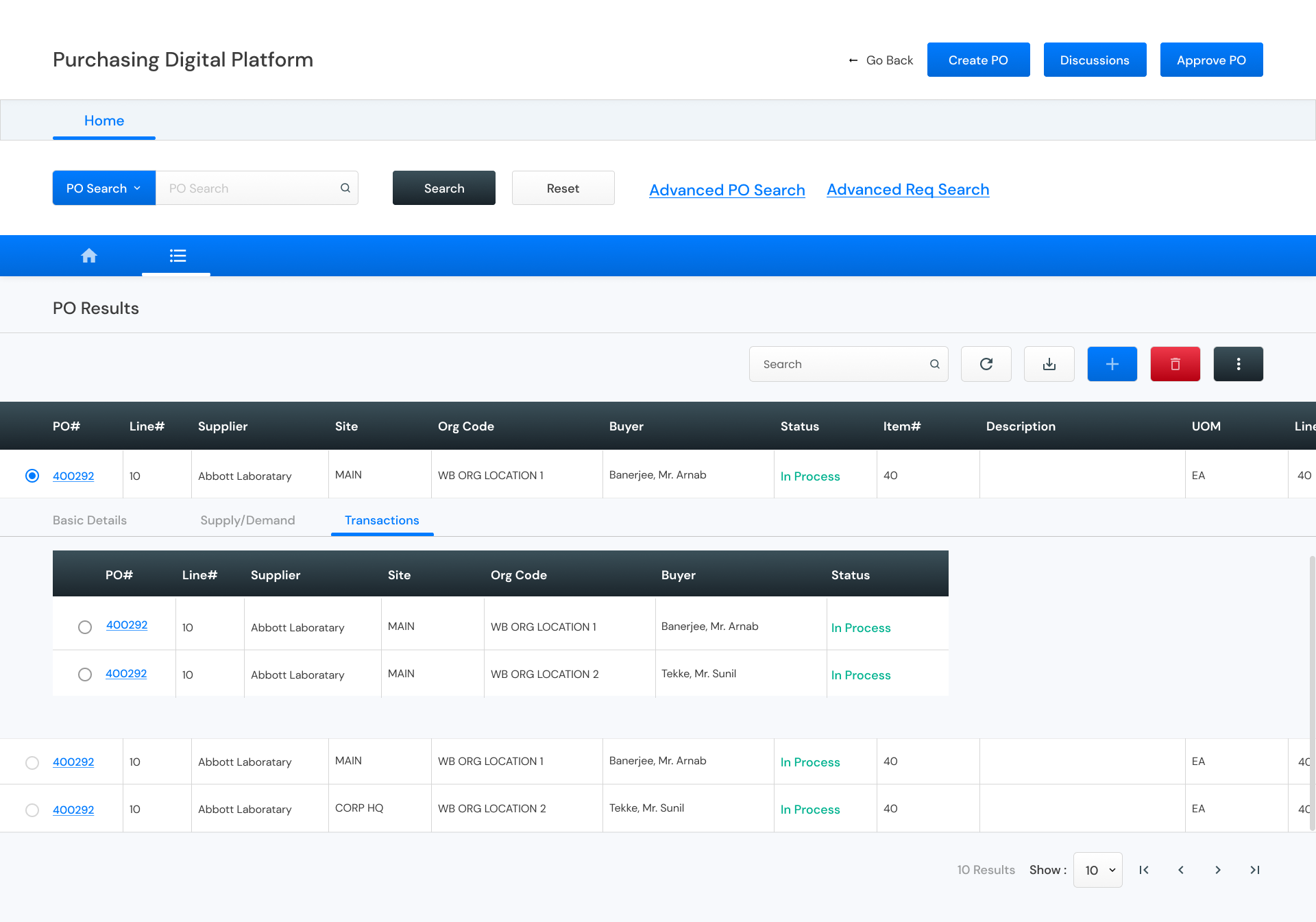
To show records in a tabular format. The red highlighted icons are the toolbar of a table to perform Basic CRUD operations along with download and refresh. Table cells can have calender, image, progress bar, form input. Max column on screen should be 10.
Multi Card ( Old vs New )
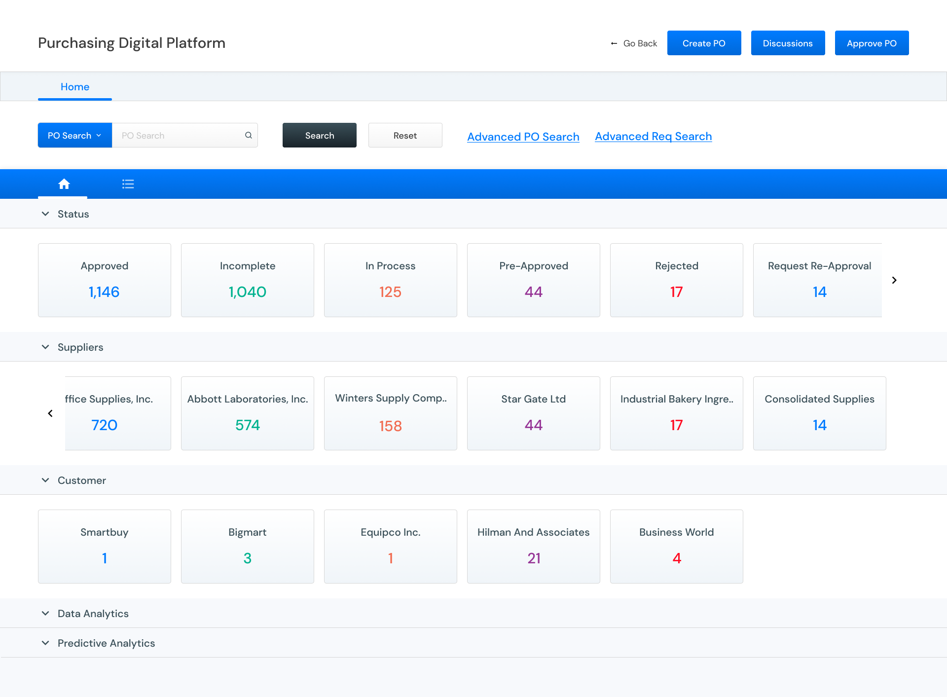
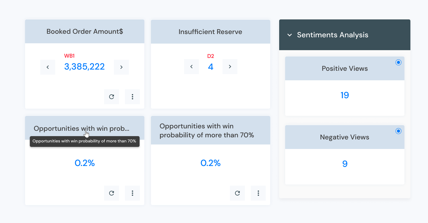
Collection of multiple cards shown in a row rendered from a single API.
Horizontal navigation is controlled using arrows at both ends.
Single Card ( Old vs New )
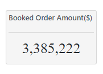
Normally used to show some value count. Card Body can also have single or multi values. Max 3 rows should be displayed in a view. Next set of records should be coming in pagination. Card footer will have action buttons.
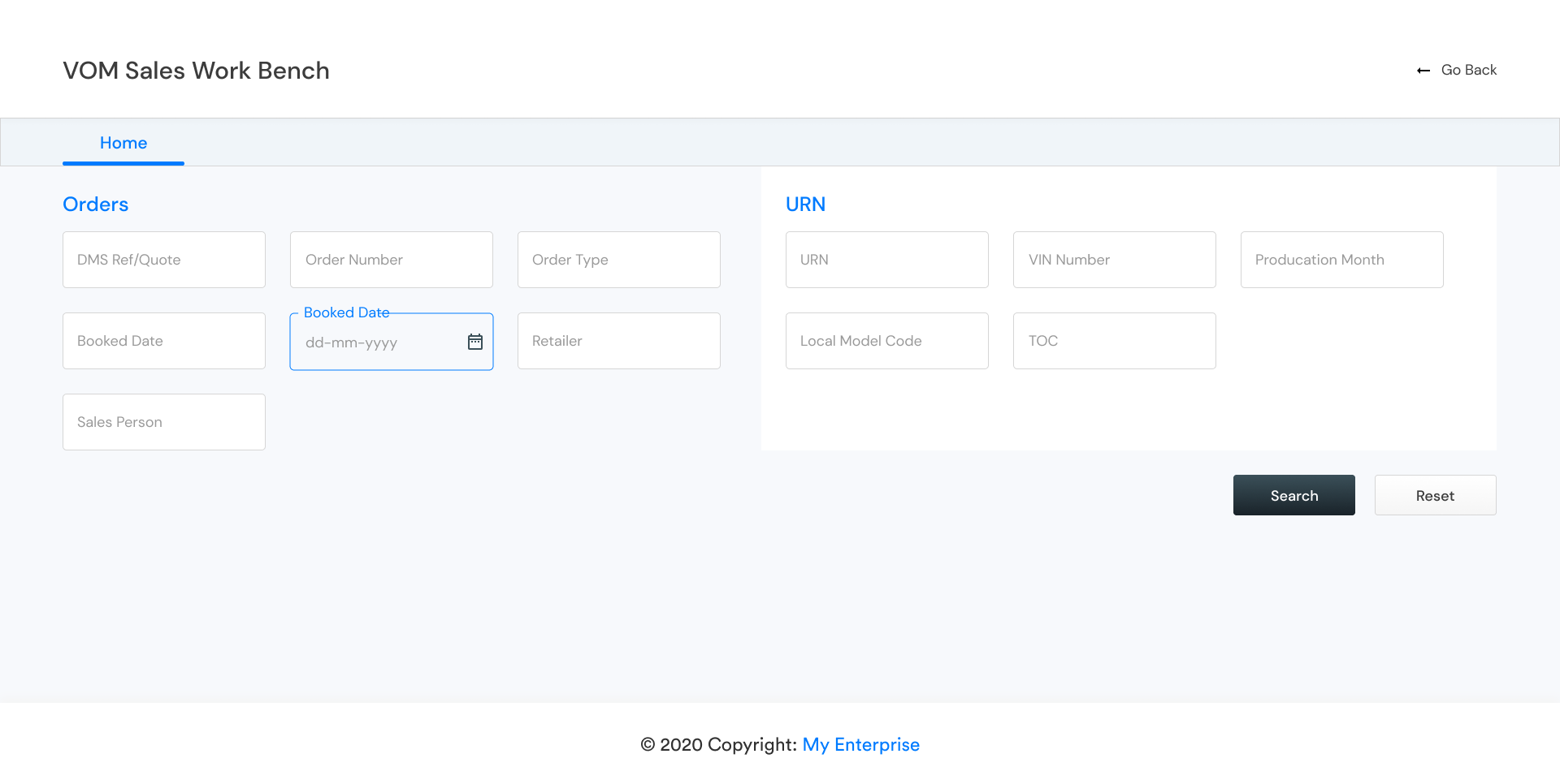
Search Blocks ( Old vs New )

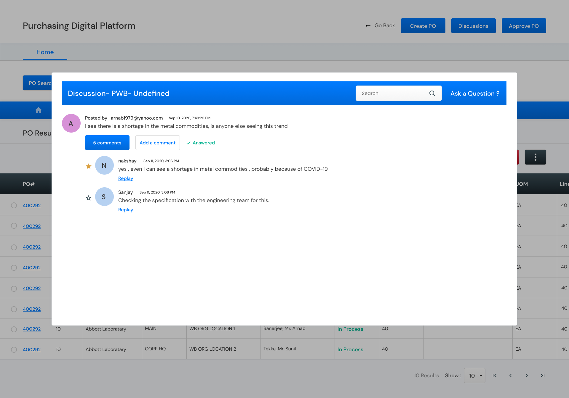
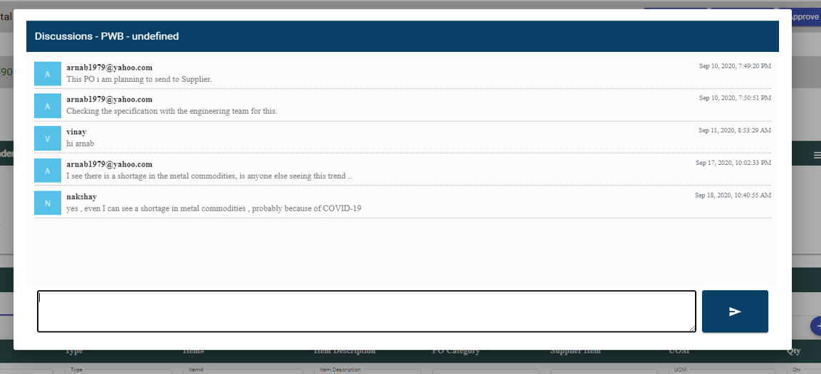
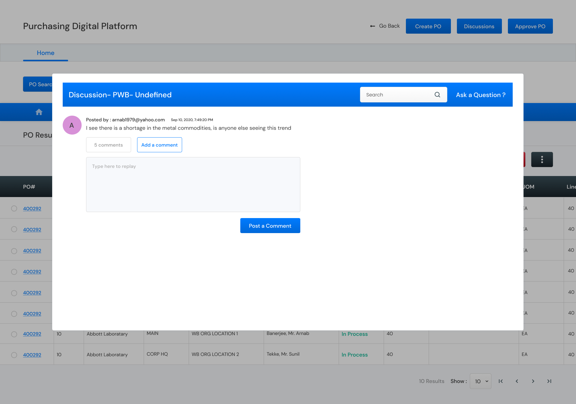
Discussion Portal ( Old vs New )
Service to start a discussion on any topic. Opens in a popup.
5. Deliverables
